|
Book Production[Book Covers] [Roundels] [Almanac and Prognostycacyon] [Dickon's Lament] [Broadsheets] [Crown Paens] The Tales of Canterbury FaireThe intent of this project was to produce a work which approximated the type and nature of a mid-16th century English publication, to showcase the excellent material resulting from the Bardic Auction at Canterbury Faire in ASXXXVIII. The text was typeset electronically, primarily using the JSL Ancient and JSL Blackletter fonts, as developed by Jeff Lee based on the transitional typefaces used by English printers Edward Jones and J. Redmayne in the latter part of the 1600s. While technically outside the SCA period, Lee's fonts are very close in style to period typefaces used by printers throughout Europe. Ligatures were used for tied lettering, but, for readability's sake, the long s was not used nor were j and v converted to i and u, and w was used instead of, as per some period examples, a doubled-up v.
The title-page follows standard conventions of the time, being a mix of fonts and explanations, along with publisher information including the timing and place of printing. Title pages were relatively late to develop, not being fully established until the 16th century according to Steinberg (pg 68). Their layout is very characteristic, and a number of excellent late-period examples are accessible via the Shakespeare's Sonnets Website. A dedication was a common feature, though many period ones run to multiple pages of very flowery flattery (see , by William Barley, 1596, used as the basis for the Tales' dedication). The text ends with a colophon; this tail-piece was typically used as the means "by which the printer-publisher proclaimed his part in the proceedings" (Steinberg, pg 60) and I've also used it to acknowledge source material. It was typically set with text centered as it flowed down the page or to produce a shape, such as a goblet or hourglass.
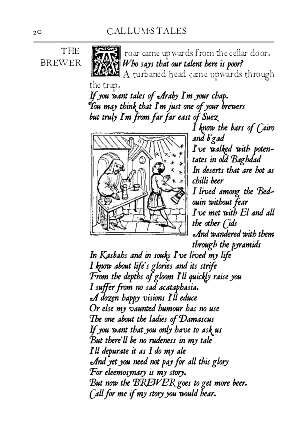
The illustrations come from a wide variety of sources, most notably the Boke of Good Cookery clipart archive of period woodcuts. I developed others electronically, most notably the large capitals where suitably relevant illustrations and typeface have been combined following a very helpful suggestion from Master Crispin Sexi.
The main criteria for illustration selection was their appropriateness for the period and nature of the printing - almost all are woodcuts or engravings from the 15-16th centuries - as well as their relationship with the subject matter.
The general layout of the work, in terms of pagination, running heads, use of illustrations and capitals, design format etc was developed after many, many hours poring over large numbers of period examples in texts, online and in museums. In particular, a visit to the Gutenberg Museum of Printing in Mainz provided access to a huge range of period printed samples, though the lack of any substantial captioning in English was a tad frustrating. The paper used is laid, cotton-based, 100gsm cream Conqueror, folded to produce a quarto (roughly A6). It is a reasonable approximation of the type of paper in common use for printing in later period, described by Middleton as of linen or cotton rag content with a yellowish tint and well sized (pg 3). This book is some two centuries away from the first recorded use of paper, which was in 130,8 for the Register of the Hustongs Court of Lyme Regis. The basic binding techniques used are period ones, for the most part using period-style equipment, including a book press, bone folder, basic sewing frame techniques, linen thread, beeswax, bodkin and hammer. A list in Middleton (pg 245) gives the equipment inventory for the 16th-century bindery of Nicholas Pilgri, stationer and binder of Cambridge (d 1545), which included:
I chose to use Plastipad for gluing, a glue used by modern bookbinders. I did not want to experiment with period wheat-paste starch in the limited timeframe available, particularly because these were intended for gift or sale. That's a project for another day. Codex binding has not changed a great deal in its basic approach over the centuries and books by modern craft binders such as Shareen LaPlantz and Arthur Johnson provided a useful adjunct to more academic works. Soft-Cover Mass VersionAlmost 50 copies were made of the soft-cover Tales, with almost half designated as gifts for participants and supporters of the Bardic Auction. In 16th-century England, small books were often sold in blue or brown paper wrappers, or often no covers at all, and stab-stitched through the side with three or five holes. These books were neither trimmed along the edges nor lettered on the outside. (Middleton, pg 11). The soft-cover Tales follows a similar approach in a two-signature, pamphlet-stitched format, sewn directly through a fold in the cover. It has been bound in burgundy book leatherette, used because a large quantity was freely available (an important consideration when producing 50 copies!). This approximates the right look, colour and style of the cheaper printed works of the mid- to late 1500s. Alison Plowden, writing in Elizabethan England, Life in an Age of Adventure (Readers' Digest 1982), noted: "At the cheaper, and more remunerative, end of the trade, books and pamphlets sold for sixpence or a shilling (the equivalent of modern paperbacks) were illustrated ith woodcuts and either just sewn together or roughly bound in a limp vellum cover." She also noted that the maximum number of copies for any one edition as laid down by the Stationers' Company was 1,250. If more were needed, you had to reset all the type! Presumably this was intended to ensure even distribution of work amongst the printers, but I suspect that few print runs made it to this level in any case. My soft-cover has a jute string band fore-edge closure with a scallop shell token. Wrapping bands with ornaments were a common feature of books, (I chose jute over leather strapping purely for economic reasons). Wrapping bands are typically wound round the book over the fore-edge two or three times with the end (often fitted with an ornamental piece of bone) being tucked in between the strap and the lower cover. (Middleton, pg 127). In the early days, heavy metal clasps were nailed onto the wooden boards; for some reason, the English did their back-to-ftont to everyone else and had their clasps on the upper cover and the catch on the lower. From the 12th century, binders started to use large plaited thongs with loops which fitted over bone pegs set in the edge of the lower cover. By the time lighter pasteboard came into use, linen ties became popular as a lighter, more economic approach. These would typically consist of two pairs of 15-20ml tape, (green, brown or blue) threaded through holes about 10ml in from the foreedge. Leather wrapping bands and linen ties remain in common use in hand-bound books -- I've seen lots of close-to-period examples in bookbinders' shops in Florence and Venice. The decorative tokens on the cover are made of plaster, using the Canterbury Faire mould; similar bosses made of metal were common decorative and protective fixtures for period books.
HardCoverThe presentation hard-covers are based on the common Tudor and Stuart practice of binding books with embroidered covers, usually of velvet or satin with gold, silver and silk needlework. According to Middleton (pg122), large areas of the velvet covers were typically left untouched because of the difficulties involved in sewing piled materials, and applique decoration was used to overcome this, as has been the case with these examples. Various leathers were also popular for binding -- goatskin, doeskin, deeskin, pigskin, sealskin, sheepskin and calfskin, with the latter most common. The hard-cover decorations have been based, for the most part, on the devices of the people for whom each book is intended. The embroidered Y, for Yolande, is based on the initial I developed for a broadsheet of Lady Theodora's poem for the then-Queen of Lochac, using crown and borage symbols relevant to Yolande and her lord. The embroidered C is based on a common technique used to produce capitals, whereby a border motif or woodcut area is overlain with a capital letter. In this case, the C is for Master Crispin Sexi, who provided me with ideas and inspiration regarding this approach to developing the large caps in use throughout the Tales; the motif comes from a section of Ravenscroft's Pammelia (1609) , which Crispin provided. The hard covers use archival mounting board, comparable to the pasteboard that replaced wooden boards in the early 1500s. The signatures are sewn over tape through recessed sawn cuts to produce a flat spine, a period approach still in use in fine binding today. Although leather over cords produces the raised effect often thought of as an older style of binding, flat spines were in production in England from the 7th century, and proactively recessing cords or tapes was common in the 16th century (Middleton pg 17). The endpapers consist of four leaves sewn in as part of the text block. Middelton says that "the outer two leaves…were often stuck together to make a stronger pastedown while the two inner leaves were sometimes pasted together to [make] the flyleaf" (pg 19). Plain endpapers were common in Elizabethan publishing, often made from waste paper or reinforced with vellum; marbled endpapers weren't used in England until 1655, as it typically lagged behind the Continent in terms of technique and practice. Using a plough (an implement somewhat akin to a carpenter's plane) to neaten the edges of the paper was reasonably common by the mid-1500s, but I've chosen not to do this. the smaller signatures of the hard covers don't really require it for alignment purposes, and the soft-covers wouldn't have warranted the additional work. One thing I would like to have included was headbands, which were coloured silk threads, usually in two colours, used to cap the endges of the signatures within the spine for added strength and protection -- you can see them still on well-bound books today. Bookbinders began to use stuck-on headbands (rather than sewing them in from scratch) in the 16th-century, and headbands of this type are still available today. Time constraints precluded their use in this project, but I hope to learn how to make them for future efforts. One of the presentation books has a tied closure, commonly found in fine binding from 1530 to 1640 (Middleton pg 125), when such ties replaced the heavier metal clasps associated with older, wooden covers.
|
||||||||||||||||||||||||||||||||||||||||||||||||||||||||